SHEFIT
Designing responsive e-commerce solutions for a direct-to-consumer sports bra company.
PROJECT TYPE
E-Commerce
Clothing/Fashion
TIMELINE
5 weeks
ROLE
UX Researcher
UX & UI Designer
BREAKING DOWN BARRIERS FOR A DIRECT-TO-CONSUMER PRODUCT
SHEFIT is a start-up sports bra company with a mission to empower women of all shapes and sizes through their athletic wear. They want to continue their success by revisiting their website’s design to ensure the e-commerce experience they offer is optimized for their users’ needs.
Ordering sports bras online is often confusing, challenging, and risky for the user. SHEFIT’s product pages had to provide enough sizing data and social proof to encourage users to purchase sports bras and make them confident in their selected fit.
The Challenge
Objectives
Research user journey flows
Identify high-value product information & features
Design a responsive product page UX & UI
THE RESEARCH
I developed a research plan that included primary and secondary research methods to gather insights and identify areas of opportunity for SHEFIT’s website specific to improving a user’s purchase user flow. My research objectives were to understand a user’s typical online sports bra purchase, uncover common pain points, and identify features used to assist in decisions.
Planning it out
100% of all participants interviewed and surveyed use product photos, customer photos, and customer reviews to make their online purchasing decisions.
Sizing & fit choices were the most common pain points participants noted.
All participants utilized multiple data points or desired multiple data points to understand & determine fit.
Support & comfort were the most important features in a sports bra.
Research findings
Aligning user needs and business goals
Being a direct-to-consumer company, it’s important for SHEFIT to make sure customers order the correct product size to minimize returns. Finding and selecting fit are primary customer pain points when ordering sports bras online, as well as being potential purchase deterrents. This presented an ideal UX opportunity to align both user needs and company goals.
THE STRATEGY
Persona development, user flows, and wireframing
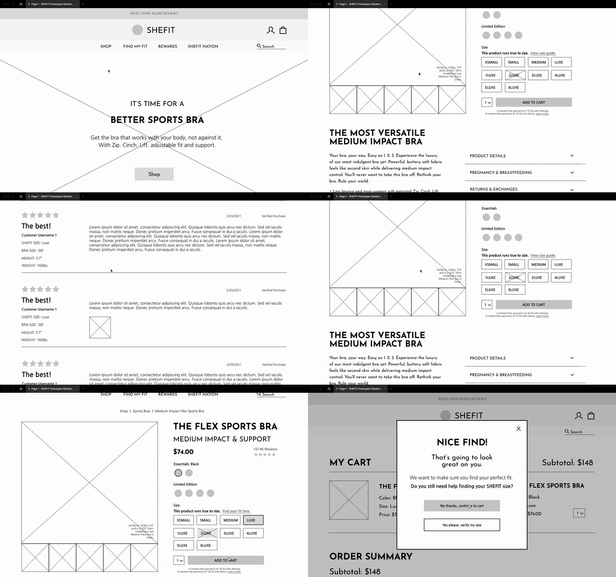
I created a user persona and user flows for a sports bra purchasing journey following my user research to better empathize with users and keep the key elements of the research at the forefront of my UX designs. I then dug into creating mid-fidelity wireframe prototypes that addressed the design opportunities I found while capitalizing on SHEFIT’s existing branding, copy, and UI features.
I completed user testing on the prototypes to validate my designs and seek further improvements. Participants were given a set of tasks to work through and complete within the prototype designs.
All participants were successful in their task completion and were confident in finding, understanding, and selecting sizing based on the product page’s new features.
Prototype testing and results
THE DESIGN
The new features added to SHEFIT’s website were design opportunities that optimized both user needs and company goals by enhancing the experience for users looking to find their correct fit and purchase sports bras online.
-
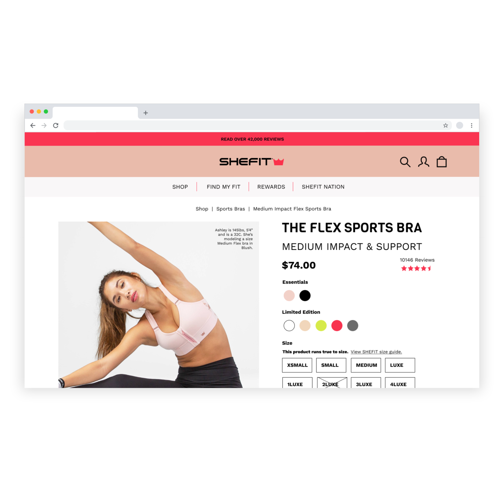
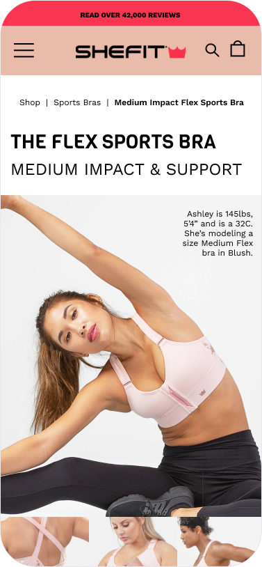
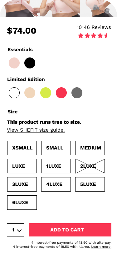
Goal: Easily identify essential product features, details, & information. Find sizing information at a glance.
Features Added:
Clear support & impact level at the top of the page.
Model’s dimensions & SHEFIT size on product photos.
Authoritative size recommendation (runs true, runs tight, etc.) near sizing choices.
Clear product detail bullets that highlight SHEFIT’s value.
New “pregnancy & breastfeeding” tab specific for mothers to learn more about sports bra benefits & features for them.
-
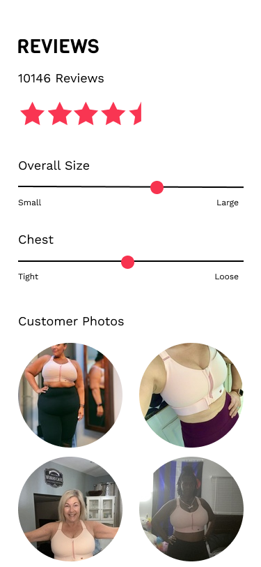
Goal: Quickly review consolidated customer photos, overview fit metrics, and body dimension filters for better fit comprehension.
Features Added:
Review overview section with customer-rated sizing meters to help users determine product fit
Customer photos section for users to browse all photos, or browse reviews by photos
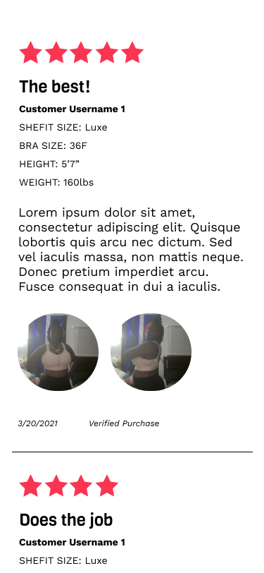
Customer height & weight details added to filters and reviews for browsing
Re-organization and streamlining of customer reviews for better hierarchy and readability
-
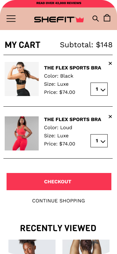
Goal: Easily identify support level and ensure customers adding items to their carts have their correct SHEFIT size.
Features Added:
Impact level icons added on homepage product sections
Pop-up on cart page to prompt users to validate and/or find their fit
Project Challenges & Learnings
Users assuming their bra sizes.
Since SHEFIT uses its own proprietary sizing and relies solely on online orders, it was pertinent to ensure users found their correct SHEFIT size prior to ordering. Many users would skip reviewing the size chart or size quiz and pick their usual size after validating that the product was true to size through reviews. To remedy this, I added the size validation pop-up on the cart page to prompt users to find their SHEFIT size. This made users stop and think to validate their size before they got too far in the checkout process or ordered an incorrect size.
Users gauging size based on customer reviews and photos.
Direct-to-consumer products rely heavily on social proof and proving credibility. I went into the project knowing reviews were going to be important but wasn’t expecting how the majority of users use solely customer reviews and photos to make their purchase decision AND choose their size. With how personal of a fit sports bras are, users felt they couldn’t rely on standardized size charts and felt more confident utilizing customer reviews and photos from women of similar statures to make their sizing decisions. Due to this, I had to re-plan my strategy for SHEFIT’s reviews section to accommodate how users were browsing and filtering reviews to optimize browsing by height, weight, and bra size.
Users not seeing the product’s full value.
Being a startup company with an innovative product that functions differently from so many other sports bras on the market, it was important for SHEFIT to highlight why their product brings value, how, and to whom. During research, I found users thought this was a typical sports bra and were price-shy because of it. To combat some of this, I added additional drop-downs and copy within the product details section to highlight more of the product’s features, benefits, and the value it brings to all SHEFIT audiences.
Future features
These were additional opportunities for future iterations of SHEFIT’s website that could improve the user experience.
-
Adding a “free shipping” incentive as an option for users who don’t want to pay for shipping. The majority of participants noted they would always add extra items to their bag to hit a minimum cart total if that meant receiving free shipping.
-
Implementing a try-on program for users to try on their sports bras at home and ship back the sizes that don’t work for free. It was noted that many participants order multiple sizes to do this anyway, but would avoid doing this online at retailers with no physical brick and mortar location because of the hassle with return policies.

